


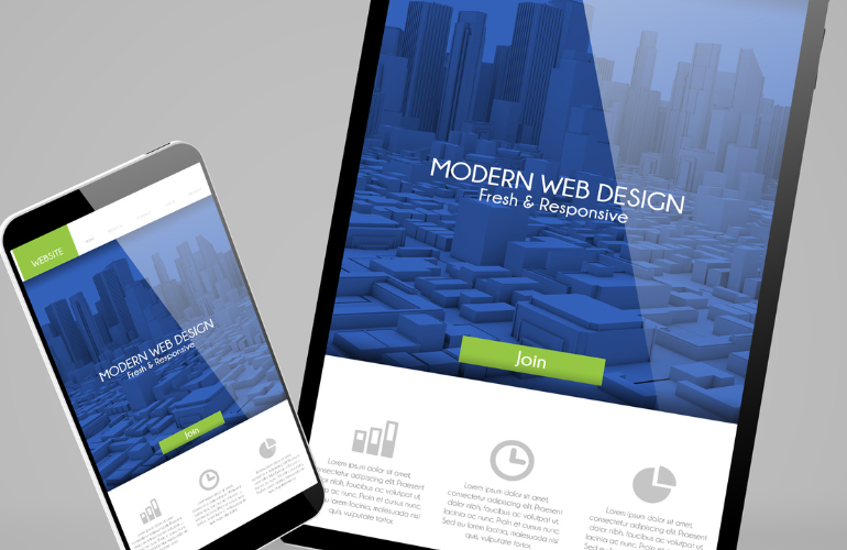
A landing page is a digital storefront that acts as both a sales tool and marketing collateral. An attractive and optimized landing page design can drastically change the course of your online business. In the digital transformation era, every business needs a website to grow faster and gain the trust of its potential customers.
A recent survey shows that the 293 million people in the US, more than 90% of the population use the internet, while 63.1% of the world’s total population uses the internet today. A business website can help you target the audience worldwide and boost your sales and revenue.
A landing page is the most crucial component of your business website designed to achieve specific business goals. It helps to engage and excite the customers by offering a resource relevant to their desired products. You can use different marketing campaigns to help users visit your landing page.
You can create different landing pages to achieve various business objectives, such as;
- Maintenance Mode Landing Page
- Coming Soon Landing Page
- Sales Pages
- Thank You Page
- Squeeze Landing Page
A landing page tends to focus visitors on a single goal instead of sending traffic in different directions.
Let’s dig deeper to explore some of the best landing page design examples to help you offer your potential customers different resources.
Wix Landing Page
A landing page is the essential component of your integrated marketing strategy. So it must be attractive and engaging! The Wix-a top-rated CMS (content management system), has a simple and interactive landing page. It has minimal text and a single call-to-action button.
The Wix landing page focuses more on driving you through sales funnels. The minimal text and page layout does not distract the customers. However, you can get additional information by scrolling down the Wix landing page.
With a captivating and stunning digital illustration, Wix has transformed its landing page into a creative playground. It has an impressive balance between clear text and white space. Certain touchpoints, such as the mountain’s peak on the page, encourage customers to get started and explore further.
The Wix landing page highlights the power of the Wix CMS (content management system) and speaks for itself. You can take the following inspirations from this impressive landing page;
- Single Call-to-Action
Wix landing page encourages you to use only a single call-to-action button. More than one call-to-actions can leave the visitors thinking about where they should start. It is worth mentioning that the call-to-action of the Wix landing page remains constant throughout. It does not even change its text, size, and color. Moreover, it repeats throughout the landing page to allow visitors to get started at any moment.
- Visually Attractive
A recent Social Science Research Network study reveals that 65% of people are visual learners. Wix landing page uses the tactics of visual appeal to highlight what your services can deliver. You can also use this approach to engage your target audience and show the effectiveness of your offerings.
- Keep Things Simple
Wix landing page encourages you to keep things simple and less. It does not contain navigation to another page. The minimal text and lack of whistles help visitors stay focused and easily explore.
Lyft Landing Page
Lyft landing page is a good example of conquesting marketing tactics where you pay for your ads to display alongside your competitors. This landing page knows that people are looking for making money. So it does not hold any punch and highlights a technique of making money!
The sub-headline of the landing page gives visitors social proof that other people are making great money working with Lyft. A CTA (call to action) button, “Apply Now,” brings prospects to the top of the page to start promptly.
Lyft landing page uses the responsive design technique to adjust its size according to the device used to view the page. The unchecked opt-in box makes the visitors feel that their choice is important. On top of that, the calculator feature of the page helps visitors determine how much money they can make if they work with Lyft.
Here are some top inspirations from the Lyft landing page that could help you design an eye-catching page for your audience;
- Use Engaging Ad Copy
Lyft’s landing page has a “Why Lyft” section that uses minimal iconography to highlight the main benefits of working with Lyft. The page ensures a guaranteed income flow. For your landing page, you can use this tactic of engaging ad copy. You can create headlines for the page’s top section to grab your visitors’ attention. It is great to ask the customers what they love most about your business. You can launch your landing page with one set of ad copy; if it does not give tailored results, modify the design and text.
- Personalization
Personalization is crucial for effective marketing campaigns. Lyft’s landing page is based on the visitors’ geography to determine their city and earning potential. You can also add some marketing tactics of personalization to your landing page to grab the attention of your visitors. Personalization in marketing campaigns needs data collection from your target audience.
Shopify Landing Page
Shopify’s landing page is the best option if you have a business in the eCommerce space. The landing page of Shopify compasses all the essential features needed to get an interactive storefront. A simple, attractive, and easy-to-handle landing page that uses key selling points to attract your target audience. The Shopify landing page focuses on a single call-to-action button to avoid confusion.
This landing page is equally capable of serving mobile device and desktop users. Shopify allows you to start using the services for free to check whether they suit them.
You can take some strategic inspiration from the Shopify landing page to design an appealing page of yours;
- Add Incentives
Everyone likes free stuff and incentives, so Shopify includes a free trial on its landing page. You can also include some add-ons with the purchase or free trials on your landing page to appeal to your target audience. These marketing tactics can increase conversion rates and boost sales and revenue.
- Analyze the Performance of the Page
Shopify landing page encourages you to understand your top selling points through testing. You can use web analytics and collect data information to check the performance of your landing page. It is imperative to adjust the page elements and other aspects until you see a continuous improvement in your page’s performance.
- Use Key Selling Points
Shopify uses its key selling points to highlight the credibility and effectiveness of its services. You can do the same for your landing page, as it will help you gain the trust and loyalty of your potential buyers. Use the key selling points in your landing page content to highlight what makes you compelling.
Zoho Landing Page
Zoho is a strong CRM (customer relationship management) tool that provides personalization tactics to your marketing approaches and helps your business grow faster. Zoho’s landing page displays the names of reputable companies using the product at the top. It highlights the authenticity and credibility of this CRM tool.
The plain white background and clear text prevent distractions and help visitors stay focused. The page has a CTA button and a red “sign up for free” button at the top to encourage visitors to take immediate action.
In the top section, Zoho’s landing page highlights the pricing plan, benefits of using this CRM, and other information. The page contains all this information in a separate navigation bar which only appears when you scroll down the page.
You can take great strategic characteristics from the Zoho CRM’s landing page, such as;
- Show your Strengths
If you’re designing a website for selling a product, it is important to highlight your strengths on the landing page. Zoho’s landing page displays the name of all reputable companies using the CRM product. You can also add this tactic to your landing page to show the authenticity and effectiveness of your products.
- Provide Information about the Product
It is a great idea to add some useful product information at the top section of your landing page. It will help visitors make wise decisions about your offering/product. You can add the most important information about your product to maintain the right balance. It can encourage the visitors to feel comfortable starting with the CTA button.
Clearbanc Landing Page
Clearbanc helps investors start their businesses with ease. The landing page of Clearbanc highlights why it is a great choice to start a new business. It uses a strategic approach to get the visitors’ personal information, like it starts entering your first name.
The Clearbanc landing page ad copy highlights delivery of $10 million within 24 hours. It shows its credibility by displaying some reputable news sources like the Wall Street Journal. On top of that, the page compares its services with the competitors to stand out from the crowd.
If you’re running a B2B (business to business) eCommerce business, you can take some effective inspiration from the Clearbanc landing page;
- Highlight the Reviews
If your business/brand has received compliments or good reviews from a recognizable resource, you can highlight that on your landing page. It highlights the authenticity of your business and encourages customers to buy your products/services confidently.
- Highlight your competitors
Clearbanc compares its services with the competitors like banks zero and VCs to convey a sense of reliability and quality. It is an effective way to stand out from your rivals and highlight the authenticity of your offerings.
JustAnswer Landing Page
The JustAnswer landing page is a great inspiration for educational institutes that want to build a business website. The landing page of JustAnswer has a box named “Ask your questions here.” It helps visitors to learn about the sample of JustAnswer and educate themselves at the same time.
Like Clearbanc, the landing page of JustAnswer also highlights the news outlets from recognizable resources such as the New York Times. It delivers a positive company perspective and encourages visitors to take immediate action.
You can add the following suggestions from the JustAnswer landing page;
- Highlight Testimonials and Customer Reviews
JustAnswer highlights its positive customer reviews and testimonials on its landing page. You can also adopt this tactic to build trust in your offerings from your target audience.
- Chat Functionality
JustAnswer provides a chat functionality on its landing page. The feature of automatic or immediate responses needs a professional team or chat software. If your prospective audience does not get an on-time response, it may lead you towards failure. So, if you want to include a chat functionality on your website’s landing page, you must ensure proper resources to get tailored results.
MailChimp Landing Page
Mailchimp allows you to create effective marketing emails to get a positive response from your target audience. The aesthetic look of the landing page and mascot highlights the strength of Mailchimp in a fun way. The bright background color with aesthetic design grabs visitors’ attention at a glance.
The CTA button of the Mailchimp landing page appears at the top of every page to encourage visitors to take prompt action whenever they want. The page’s responsive design fits its size according to visitors’ viewing screen.
Some top-notch inspirations from Mailchimp for creating an easy and super user-friendly landing page;
- Use Simplified Marketing Approach
The landing page of Mailchimp encourages to use of a simplified marketing approach. You can use the different sections of your website as landing pages. You can make a user-friendly landing page by keeping the CTA button visible at the top of every page. You can use several landing pages to obtain different marketing objectives.
- Use Aesthetic Design
Using an aesthetic design from your website’s landing page can grab visitors’ attention at a glance.
Bottom Line
Landing pages are separate web pages designed for sales and marketing campaigns. They can help you leave a good impression on your visitors, build trust in your offerings and deliver more leads and conversions. You can get inspiration from our seven best landing page design examples to design a powerful landing page for your website.